Choosing Colors for Printed Apparel
January 9, 2020

Many times, when decorating promotional products, selecting colors for the product and embellishment is easy. Most logos come with colors already chosen, so it is as simple as matching a color to an ink or thread. Apparel colors can be chosen to complement the logo or for functional reasons such as bright safety colors for construction apparel.
But what do we do when colors aren’t predetermined, such as when you are designing something from scratch? There are a dizzying array of ink and thread colors to choose from, so choosing the right ones can be hard. Considering aspects of color theory can narrow down the selection process.
Color “Emotions”
Ever since humans started to use dyes to change the colors of things, we have been using colors to evoke certain emotions and to symbolize things. Using colors to tap in to their emotional symbolism is a great way to evoke the specific interest and goals meant to be communicated by a design. Here are some example of what the use of certain colors is supposed to bring to mind:
- Red and Yellow – Excitement, heat, activity, and hunger
- Blue and Green – Freshness, stability, trustworthiness
- Blue and Purple – Calm, tranquility, loyalty, confidence, power
- Black and White – Elegance, formality, strength
Color Combinations: Seasonal, Complimentary, and Analogous
Once a main color is chosen, we often want other colors to go with it. Different color combinations can help further promote the emotion of the main color, or to enhance the design as a whole by complimenting the main color. Some examples of reasons certain colors go well together are as follows:
Seasonal colors – Certain color combinations bring to mind different seasons, such as gold, magenta, and brown being associated with fall leaves.
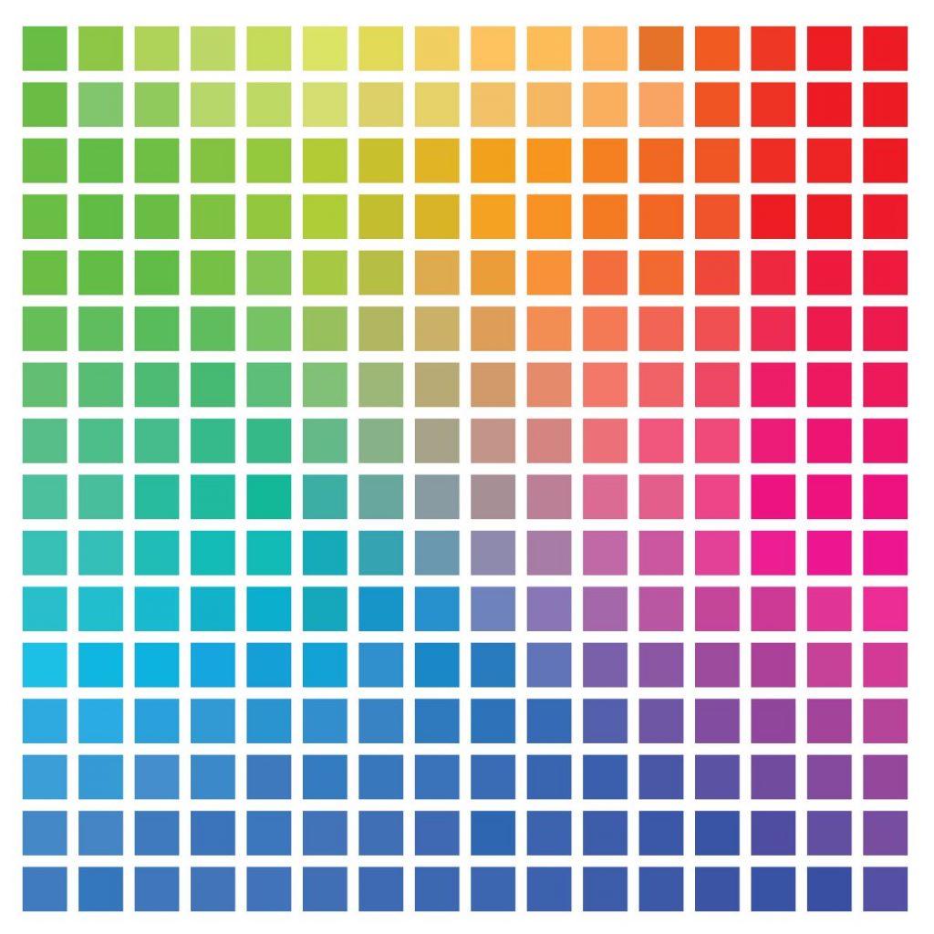
Complimentary colors: colors that are opposite each other on the color wheel, such as orange and blue, make each other look better because they contrast well.
Analogous colors: 3 Colors next to each other on the color wheel such as Yellow, Orange, and Red look good together by providing a rich, monochromatic look.


