Color Psychology and Your Brand
February 13, 2018
WHAT IS COLOR PSYCHOLOGY AND HOW DOES IT AFFECT MY BRAND?
Color psychology is “the study of hues as a determinant of human behavior.” Color is something that influences our perception rather we are aware of it or not. Picking your logo is not just deciding what colors look nice next to each other. According to a study on The Impact of Color on Marketing, “People made up their minds within 90 seconds of their initial interactions with either people or products. 62-90 percent of the assessment is based on colors alone.” This means you only have a little over a minute to make an impression on potential customers!
As a customer, you might not know (or give much thought) to why you’re drawn to a company. Does your stomach growl or your mouth start to water when you pass by a McDonalds? There’s a reason for that, and it has (almost) everything to do with color choice. Red and yellow is the most pervasive color combination in logos for fast food brands. McDonalds, Denny’s, Burger King, In-N-Out, Pizza Hut, and Wendy’s all have red and yellow logos. This is not a coincidence. Warm colors generally make us hungry, and cool colors generally suppress our hunger.
GRAB A PEN AND A PIECE OF PAPER!
You’ll want to ask yourself these questions when determining your what your brand’s color scheme should be:
- What are you trying to tell your customers about your brand?
- What does your brand do/sell?
- Who is your target audience?
- Gender
- Age
- Location
- Occupation
- Interests
- What are your brand’s values?
- What is most important to your brand?
- Who are your competitors?
- Create a list of your competitors, so you can check out their logos and see what they are doing right (and wrong)
COLOR PERCEPTIONS & PREFERENCES
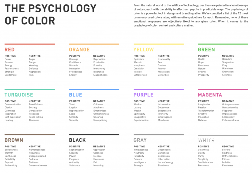
Below is “The Psychology of Color” chart that shows the pros and cons of each color. Yellow can represent a feeling of “warmth,” but it can also represent “anxiety.” Any color you pick has the potential of triggering a negative emotion in someone. Most companies’ logos will contain more than one color, which also helps with balancing out negative innate feelings a potential customer might have towards a color.
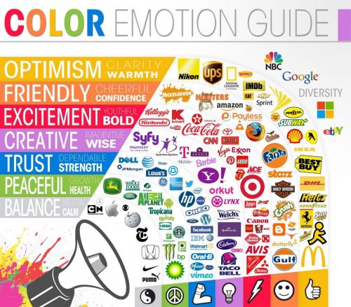
Pictured below is a “Color Emotion Guide,” featuring large companies and their logos. On the left you can see some of the emotions that each color can convey. Google, NBC, Windows, and eBay all the have multiple colored logos, which may suggest that they have a large target audience and are hoping to reach as many people as they can. Whole Foods and Tropicana are green, which suggests that they are health conscious. Dell, Lowe’s, Facebook, and HP all use blue as their color, which is most likely because they want to be seen as trusted and dependable.
EXCEPTIONS
We briefly touched on this in the previous section, but there are always exceptions to these color perceptions; “gender, age, and culture can influence how an individual perceives color.” According to the study: “Role of color in perception of attractiveness,” men prefer bright colors and women prefer soft colors. So, if your brand is targeted to one gender in particular, this is something to take into consideration.
While colors generally evoke a certain emotion in someone, they don’t evoke the same emotions in every person. “A few studies have shown that cultural background has a strong influence on color preference. These studies have shown that people from the same region, regardless of race, will have the same color preferences. Also, one region may have different preferences than another region, regardless of race.”
5 DIMENSIONS OF BRAND PERSONALITY
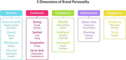
According to Dimensions of Brand Personality by Jennifer A. Aaker, brands sometimes cross between 2 traits, but they are mostly dominated by one. Below are the 5 Dimensions of Brand Personality that most brands can fit into. Brand personality is defined as being “a set of human characteristics associated with a brand.” If you consider your brand to fit into the “Sophistication” category, you might want to choose purple as your brand’s logo color because purple is usually associated with wealth and luxury. Aligning your brand’s personality with an appropriate color choice will set your logo (and brand) up for success.
What do you think your brand’s personality is?
ADDITIONALLY…
- Research your competitors
- It’s imperative for you to differentiate yourself from your competitor if you want to succeed.
- If a brand is using the color green in their logo, you may want to consider using blue.
- “Color appropriateness in relation to the product is far more important than the individual color itself.”
- You might love the color purple, but if you’re selling burgers, this isn’t the best color choice.
- A stand alone color can only do so much.
- Consider having a logo with a few colors, not just one.
IN CONCLUSION
Color is an extremely important part of marketing your brand. Surprise!
If you take your target audience, your Brand Personality type, and the purpose of your brand into consideration, you’ll be successful. Try to keep this in mind when designing your logo. And after you come up with a design (or a few designs), try creating your design in different colors as well. Poll your friends, family, and close colleagues to see how your design makes them feel. Ask people who will give you their honest opinion.
Remember that you can’t please everyone: there will always be someone who doesn’t like your color choice.
With all of that being said, the mood, feeling and image that your brand creates is what matters most.
Sources:
https://www.entrepreneur.com/article/233843
https://www.ignytebrands.com/the-psychology-of-color-in-branding/
https://en.wikipedia.org/wiki/Color_psychology
Have a question? Feel free to contact us.
