Designing With The Pantone Color of the Year Living Coral
December 10, 2018
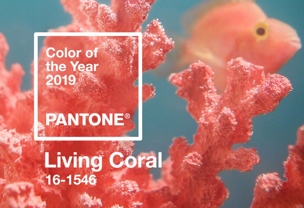
Since 2000, Pantone has announced a color of the year. Pantone is a standardized color system used by graphic designers and screen printers alike to ensure color accuracy and consistency. By choosing a color of the year, Pantone believes it best communicates and represents the year to come. As Pantone describes it, “A symbolic color selection; a color snapshot of what we see taking place in our global culture that serves as an expression of a mood and an attitude.” Recently, Pantone announced that the 2019 Color of the Year is Living Coral. How does this impact and influence the world of design for the upcoming new year? How can you incorporate this color into your upcoming designs?
A Color With A Cause
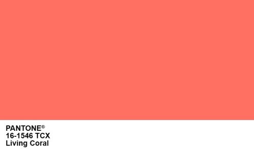
The color of the year, Living Coral aspires to capture the beauty and wonder of our coral reefs and oceans. At the point in history where these beautiful organisms are dying and threatened to extinction, Pantone chose to highlight the “living” and greatly endangered reefs and oceans. Coral reefs support a quarter of all marine species and half a billion people around the globe. Today, 50% of all coral reefs are dead and by 2050 over 90% will have died. By choosing this color, Pantone brings attention to endangered eco-systems while choosing to celebrate the power we have to change our practices and the beauty of these environments.
Designing With Living Coral
When designing with Living Coral, there’s many different avenues to take. Depending on the feel and desired effect of your final design, it will help determine what colors your design requires. A great place to start is by using monochromatic colors of Living Coral. Monochromatic is a color scheme that is derived from a single base hue and extended using tones, shades and tints. This creates a very warm, pleasing color palette that is easy on the eyes.

If you’re looking to go with bold colors that make a statement, triad colors are way to make Living Coral pop. Triad is a color scheme that typically use three hues that are evenly spaced around the color wheel. Triad colors create a very balanced design due to all colors being the same weight, or distance, on the color wheel. If you’re looking for subtle pops of contrast, try incorporating triad colors into small areas of the design.

Lastly, analogous colors are a great color scheme to create comfortable and harmonious designs. Analogous colors are colors that are next to each other on the color wheel, sharing a common color with one being dominant. When designing with this color scheme, be sure to keep in mind contrast. Since the colors are so closely related on the color wheel, it’s easy for them to become lost and blend in with each other.

Adobe Color is a great resource to help you determine the colors for your next design.
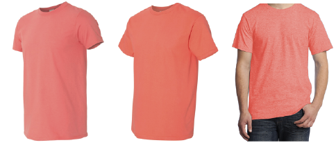
3 Shirts That (Closely) Match Living Coral
To learn more about how you can implement Pantone’s Color of the Year Living Coral, contact us.
