Choosing The Right T-Shirt and Ink Colors for Your Design
August 29, 2018
When it comes to designing a t-shirt, choosing the colors for the artwork and garment can be one of the most difficult parts. In this blog post we will give you three design guidelines to go by when designing your next t-shirt or apparel for embellishment. First stop – the color wheel.
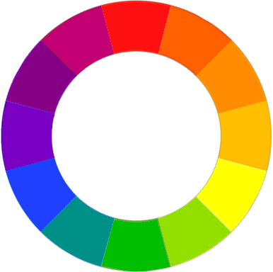
The Color Wheel
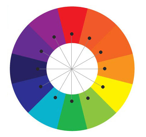
You may remember learning about the color wheel back in elementary or middle school and the relationships between colors. In the design world, these color relationships are often what is used to guide designs. Designs that follow the color wheel are often more eye catching and aesthetically pleasing. Although some color combinations may surprise you.
Quick Refresher
Primary colors:
Red, blue and yellow. These colors are then mixed together you get secondary colors.
Secondary colors:
Orange (red + yellow), Green (blue + yellow), Violet (red + blue).
Tertiary colors:
Tertiary colors are formed when mixing a primary color with a secondary color.
Complementary Colors
Complementary colors on the color wheel are those that are directly across from one another. Due to the fact that they are opposite on the wheel, they have a great amount of contrast. Complimentary color combinations are great if you want a striking design that stands out.
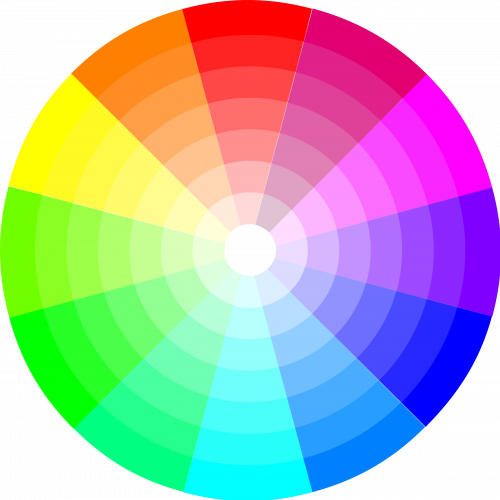
If you’re looking for a softer look, consider using a tint or shade to decrease the contrast.
Tint: Color + blended with white

Shade: Color + blended with black

Monochromatic
Monochromatic colors are dark, medium and light versions of the same color. When designing a t-shirt, consider the color of the shirt as one of the monochromatic colors. For example, if you have a dark blue shirt, a light blue design would artistically work well on it. This design of apparel is often more harmonious and calming to the eye.

Analogous
Analogous colors are colors that are located next to each other on the color wheel. These colors typically go well with one another and are pleasing to look at. Analogous color combinations are often found in nature and logo design.

These 3 color wheel harmonies will help you create a killer t-shirt next time around. If you’re still lost on your next design, our art department here at MarkIt Merchandise can surely help you create the perfect t-shirt, contact us to get started.
Sources: