The Sublimation Solution
April 9, 2019


Have you ever had a full color intricate design but only need a few pieces and are working on a budget? Like an old spaghetti western this article will help break down the Good, the Not So Good, and the Ugly with sublimation transfers.
The Good – Sublimation is a very cost effective way of getting a large scale full color image on a garment, especially when you are working with a low quantity order or a tight budget. Sublimation transfers are comprised of a special transfer paper and special ink that work together to create very vibrant prints. We start by loading the garment onto our heat press and placing the transfer in the correct location. Once the transfer and garment are aligned properly we use craft paper on the top as a barrier and then press the whole stack together with a firm pressure. This requires a higher temperature and longer transfer time than typically used with vinyl transfers. While all the layers are pressed together, the heat from the press causes the ink to transform from a solid into a gas. That gas then migrates into the fabric and once removed from the press, it transforms back into a solid. The process can be tricky and takes a keen hand and eye to create a quality print. If the transfer paper is jostled around too much while trying to remove all the layers from the press it can cause double prints or shadows to appear in the final product. Unlike screen print, once the ink has settled in the garment it will not come back out even with special chemicals.
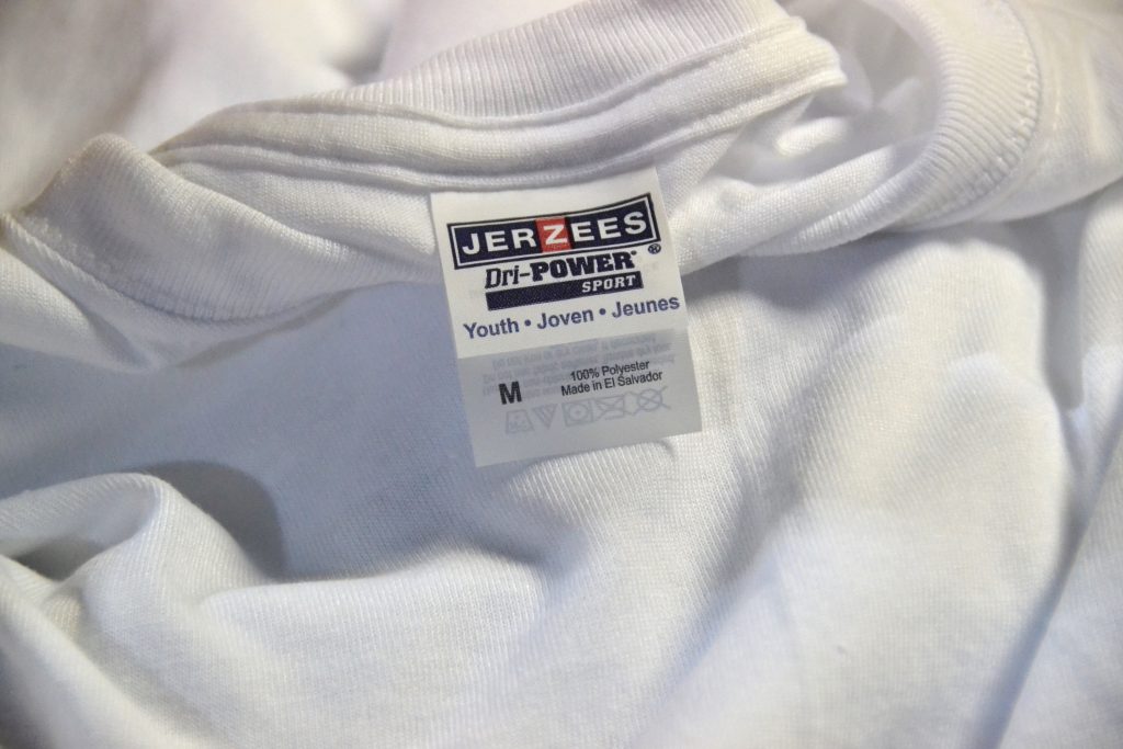
The Not So Good – The main reasons that this method isn’t suitable for every order is due to the garment limitations. This type of print is only recommended for 100% polyester white garments although can be done on other colored polyester garments. The inks from the transfer will only cleanly adhere to polyester fabrics and there is no way to transfer white with this method. This means that the base garment color will be the main color in your design. For example, if we had a logo that had a solid white fill with a black and green outline, if we were to put the design on a blue shirt, the fill would change from white to blue. The shirt color will inevitably show through and the green ink would also be affected by the blue base color, causing it to appear much darker. The black would stay the same because it is darker than the base shirt color and any alteration to the color would still make it black. The silver lining is that with sublimation becoming a more popular alternative method, it has caused some new vendors that specialize in 100% polyester shirts to pop up. They specialize in garments that have the look and feel of cotton but are actually 100% polyester and are made specifically for sublimation. They do also offer a small variation of lighter colored garments but you must remember that the base color of the garment will affect your final product.
The Ugly… There is no ugly! Only beautiful full color prints at an affordable price. I had to add it though otherwise the second sentence wouldn’t have made any sense. Thank you for reading and as always please feel free to reach out for any further information or if you have any questions.
Written by Jesse Brown, Art Director.


