The Vintage Advantage
February 28, 2019
Vintage prints are a great way to add an interesting look to your logo and save money. We have all seen shirts with a weathered print that has a cracked and faded look as if it’s weathered the years. This is actually something that’s easy to do and more cost effective than standard printing with a few small changes to your art. Some options work better than others and can help make your design stand out more by actually standing out less!
One of the first things that can be done is adding a distressed filter over top of your existing artwork in Illustrator. We have several different filters to choose from and each one adds a unique look to your art. Another way we help the print look more vintage is by dropping the underlay from the print and doing 1 stroke of each color. This causes each ink color to have a lower opacity and allow more of the natural garment color to show through your image.
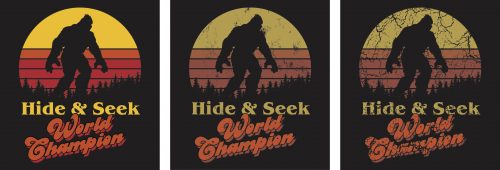
Above is an image to help illustrate these effects. On the left we have our standard solid color artwork. The middle and right image have a lower opacity to resemble the garment showing through the print. We also have 2 different distress filters in use between the middle image and the far right image. Another step towards making your design even more vintage would be to add reducer to our inks to thin them out even further giving you an even less opaque print.
As noted earlier in the article we do not need an underlay or flashing with this method which makes it more cost effective. This process works best when we are working with lighter inks and darker garments. When we switch the formula and start using darker inks on lighter garments it becomes harder to reduce the opacity to see a difference. In these cases our best option is adding a distress filter only.
To inquire about getting your next design printed with a vintage feel, contact us for more information or to get started!
Written by Jesse Brown, Art Director.